

Expunge Assist Case Study
A case study covering the design of a landing page to increase partner conversion rates
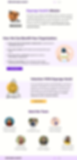
Project Overview
Project Summary
A quick review of Expunge Assist's design
(estimated 1-2 minute read time)
User Feedback from Existing Product
The need for a revised landing page was born from user interviews regarding the existing landing page (shown below)

Users felt that..
-
The existing website lacked information on the product
-
It was difficult to find where to contact someone
-
The information was too segmented within resources section
-
There was no detail on how Expunge Assist works
How might we quickly demonstrate the benefits of the product to potential partners and allow them to easily express their interest

Clickable demo to quickly show value to user
Ability for the user to try an interactive demo so they can gain a deeper understanding of the product and build trust that a partnership would be worthwhile.
1

Clearly outlined call to partners & benefit of partnership
Per stakeholder needs, a list of which partners we'd like to work with. Included a list of benefits from using Expunge Assist to quickly show benefits of product and a summarized mission statement (with a CTA to learn more) to show potential partners that our goals are aligned with theirs.
2
The Solution
About page to reiterate value and mission to partners
Increased detail on the features of the product along with a CTA for partnership. Further explanation of mission with a CTA for volunteers to sign up after understanding our mission.
3

Contact page for quick access to inquiries
A contact page with an embedded google form for both partners and volunteers to express interest and be connected with project leaders. Includes a next steps message that appears after user clicks submit.
4
1
Test early, test often
We iterated on this design by collecting feedback from internal stakeholders, which was helpful in sorting out issues with the site flow and features, however we failed to conduct user testing and were only able to have the research team carry out a heuristic evaluation. If we had more time and better experience vocalizing what our design needed, our best option would have been to conduct usability tests with the target users (potential partners) and then iterate based on received feedback.
2
Testing with Incomplete Content
I later learned that testing using placeholder text i.e. "Lorem Ipsum" can lead to skewed testing results. I would add more real-world content to the high-fidelity designs before begin any form of testing.
3
Balancing stakeholder & user needs
I was inexperienced on articulating design decisions and did not feel comfortable “sticking up” for my designs as I should have been. While there were only a small amount of changes that this resulted in, in the future I feel more experience in this aspect will benefit the design.
4
Working on a multidisciplinary team
This was my first project that had separate teams for research, project management, and design. It was a great experience to factor in many different viewpoints and be able to support differing decisions and articulate reasoning behind design choices.
Final Design
Lessons Learned
Project Background
-
Expunge Assist is a web and mobile app built by Hack for LA in late 2020 - early 2021 with the mission to help people clear sentences for non-violent crimes
-
Expunge Assist required partnership with external organizations to be successful
-
Existing website was causing users to leave the site without making contact to project leaders
Project Goals
-
Design a new landing page that enables partners to learn about the product
-
Allow potential partners to contact project leaders directly from website
-
Incorporate a way for potential volunteers to sign up with the project
-
Increase partnership conversion rates by at least 20%
My Responsibilities
-
Assist in synthesizing interview data
-
Conduct comparative analysis for the project
-
Brainstorm, create user flow, and sketch initial page design
-
Build out mid-fidelity wireframes
-
Iterate based on stakeholder feedback
-
Create high-fidelity prototype of landing page
-
Synthesize data from heuristic evaluation and iterate design based on results
Problem Statement
Taking what we knew from the user interviews, collected past user feedback, and stakeholder interviews, we formed a problem statement to guide the design
Thank you for taking the time to read this case study! This project was very rewarding to work on knowing that the end result will be going to help those in need of criminal record expungement. I feel that interacting with a multidisciplinary team to work towards designing this landing page, was the most rewarding takeaway for me and I hope to see Expunge Assist's partnership levels increase once this landing page is rolled out.
If you found this project interesting, please take a look at some of my other projects below!
Conclusion

Granted
A revision of the financial aid application process

Aquasave
Designed for an Azure IoT-based hackathon with an environmental focus
Key Success Indicators
-
Increase in partnership levels by at least 20%
-
Interested volunteers utilize contact form to successfully connect with project leaders
-
Interested partners contact project leaders with a basic understanding of Expunge Assist's capabilities
How Our Design Recommendations Might Achieve This
-
Prominent CTAs to streamline the sign up flow for potential partners and an integrated google form to reach out directly
-
CTAs and google form created for volunteers to sign up with Expunge Assist
-
Clickable demo integrated into page along with outlined mission and product features
Room for Improvement
-
I failed to suggest that we conduct user testing earlier in the process, instead we had to settle for doing a quick heuristic evaluation of the hi-fi screens
-
I feel we should have been more active in working with the development team more to speed up the project roll out
Once the Expunge Assist landing page is rolled out to the public, the following is how the success of our designs will be measured:
Full Case Study
Full review of the Expunge Assist Page Design
(estimated 6-8 minute read time)
Discover & Define
Comparative Analysis
To get a sense of the strengths and weaknesses of websites that inhabited the general space of ours, we did a comparative analysis of 5 comparable pages
Stakeholder Interview Data
The research team interviewed the key stakeholder to further learn about user needs and understand business objectives for the landing page. Below are the key points obtained from that meeting:
Notable Strengths
-
Prominent CTAs for demo testing
-
Easily scannable layouts with distinguishable sections
-
Users updated on project progress on page
-
Well-defined mission statements
Notable Weaknesses
-
Difficult to quickly find areas to contact project with questions or interest
-
Some sections i.e. "About or "How it Works" were too text heavy
User Feedback from Existing Product
The need for a revised landing page was born from user interviews regarding the existing landing page (shown below)
1
Increase rate that partners discover and make contact with Expunge Assist
(Top Business Goal)
2
Improve ability for interested volunteers to reach out to project leads
(Business Goal)
3
Define the types of partners Expunge Assist needs to be successful in its mission
(Business Goal)
4
A way to express interest in the project and contact our organization
(User Need)
5
A clear definition around what the product can do for them and their organization
(User Need)
Problem Statement
Taking what we knew from the user interviews, collected past user feedback, and stakeholder interviews, we formed a problem statement to guide the design
How might we quickly demonstrate the benefits of the product to potential partners and allow them to easily express their interest
Persona - Needs and Pain Points
After reviewing previously conducted interview results from users and the key stakeholder, we built out a user persona. The persona's needs and pain points shown below would be especially helpful in guiding the features of the page.
Needs
-
Quickly see the value they will get from partnering with Expunge Assist
-
Understand how the product works before investing resources/time
-
Easily contact organization for more info
Pain Points
-
Limited time to look into new resources
-
Struggled with using similar tools they've tried before
Ideate & Prototype
User Flow
In order to keep us focused on the user tasks and goals on the landing page, we built out a simple user flow for how a user would achieve the goal of contacting project leaders

Contact Project Leaders Flow
Wireframe
We then moved to build a mid-fidelity wireframe of the page to make a better picture of the structure of the website. This layout aimed to solve the problem by:
-
Building trust in the user with a demo section
-
Align Expunge Assist's mission with the user's organization
-
Providing a quick explanation of product function
-
Showing a clear timeline of product release
.png)
Stakeholders' Feedback
-
Development schedule feels like an unnecessary feature
-
Flow of page should prioritize sign up
-
Would prefer a way to expand on our mission and what we do past a couple sentences
High Fidelity Frames
With the stakeholders' feedback in mind, we developed high-fidelity prototypes that could demonstrate the design of what the user would actually see for our landing page

Prioritized Partner Sign Up
-
Development schedule feels like an unnecessary feature
-
Flow of page should prioritize sign up
-
Would prefer a way to expand on our mission and what we do past a couple sentences

Remove Dev Schedule & Expand on Mission
-
Removed Development Schedule
-
Added a summarized mission with a link to an about page

Remove Dev Schedule & Expand on Mission (Cont.)
-
Created about page that expands on mission and product benefits
-
Include additional CTAs to increase partner and volunteer sign up options
Test

Visibility of System Status
-
This sign up option failed to make clear to the user what would happen after they entered their email and clicked submit
Heuristic Evaluation Results
Due to time constraints, we chose to have the research team run a heuristic evaluation Below are the critical heuristic violations that were flagged:

Consistency and Standards
-
Two different sections send user to about page using two different methods
Aesthetic and Minimal Design
-
Two links to go to the same place seem unnecessary
Project Success Measurement
Clickable demo to quickly show value to user
Ability for the user to try an interactive demo so they can gain a deeper understanding of the product and build trust that a partnership would be worthwhile.
1
Clearly outlined call to partners & benefit of partnership
Per stakeholder needs, a list of which partners we'd like to work with. Included a list of benefits from using Expunge Assist to quickly show benefits of product and a summarized mission statement (with a CTA to learn more) to show potential partners that our goals are aligned with theirs.
2
About page to reiterate value and mission to partners
Increased detail on the features of the product along with a CTA for partnership. Further explanation of mission with a CTA for volunteers to sign up after understanding our mission.
3
Contact page for quick access to inquiries
A contact page with an embedded google form for both partners and volunteers to express interest and be connected with project leaders. Includes a next steps message that appears after user clicks submit.
4
Users felt that..
-
The existing website lacked information on the product
-
It was difficult to find where to contact someone
-
The information was too segmented within resources section
-
There was no detail on how Expunge Assist works